Translate

Monday, March 21, 2016

Fee Down Load This Week


New Free Goods, Available This Week Only
Camera Instax mini Pink / Hero image
by epicerie du blog in Photos
Hero image for hero header. Feminine scene / feminine styled stock photography. Pink Instax camera, pink notebook, film instax of a cat and flowers in background. --- Keywords: styled stoc…
   Get It Free   
Spring patterns
Spring patterns
by marushabelle in Graphics
Hello my amazing guests! I'm very happy to share this charming set of vector patterns with you! Flowers, plants, birds and butterflies! Enjoy the spring colors :) Perfect for backgrounds…
   Get It Free   
Complete Website Theme, HTML CSS PSD
by Ruben Stom in Themes
**Jordan Mike Theme is a minimalistic and responsive website theme. It's fully customizable: designed with Adobe Photoshop and written in HTML, CSS Javascript and PHP. With this theme you ca…
   Get It Free   
Cute Planners, cards, and stickers
by Ruslana Vasiukova in Graphics
It's a big collection of weekly planners, To Do lists, notebook pages and many different stickers set for you. Turn the organization of your time and life! :) Perfect for organizing with …
   Get It Free   
Cactus Watercolor Clip Art
by Bella Love Letters in Graphics
Hand Painted Watercolor Clip Art - Prickly Cactus YOU WILL RECEIVE: This listing is for 16 individual cactus elements, and four arranged elements. You will receive a JPEG and PNG file for e…
   Get It Free   
Beverly UPDATED
Beverly UPDATED
by MediaLab in Fonts
--- This is a wonderful font drawn by hand and with love! Beverly can be used for fashion, Invitations, business cards, design and much more --- **Many updates** - Fixed some letters - Revi…
   Get It Free   

Developing Mixed Media Art With Your iPad


Developing Mixed Media Art With Your iPad
warmth_mm
The initial thought of doing any sort of professional work on an iPad may drift to sketching, note taking, or scheduling. Usually, the assumption is that quality rendering and photo manipulation is not possible on such a casual device.
Digital artists and designers can now seriously consider an iPad as an addition to their toolset. With the increasing availability of creative apps, the new combination of iPad Pro and Apple Pencil, and overall portability, it signals more versatility on the horizon for process work.
iPads have the potential to become invaluable assets for creative industries. But how can they be utilized to improve your design workflow? Like using any tool, the answer will vary for each professional.
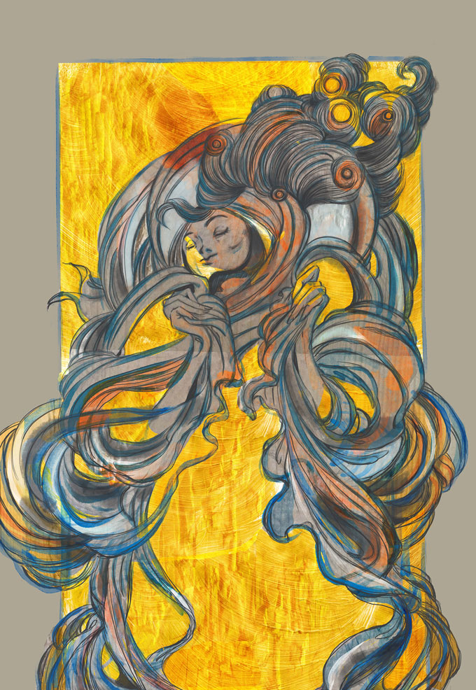
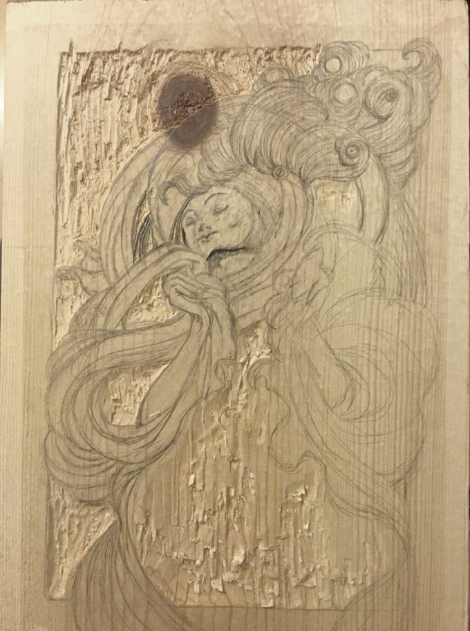
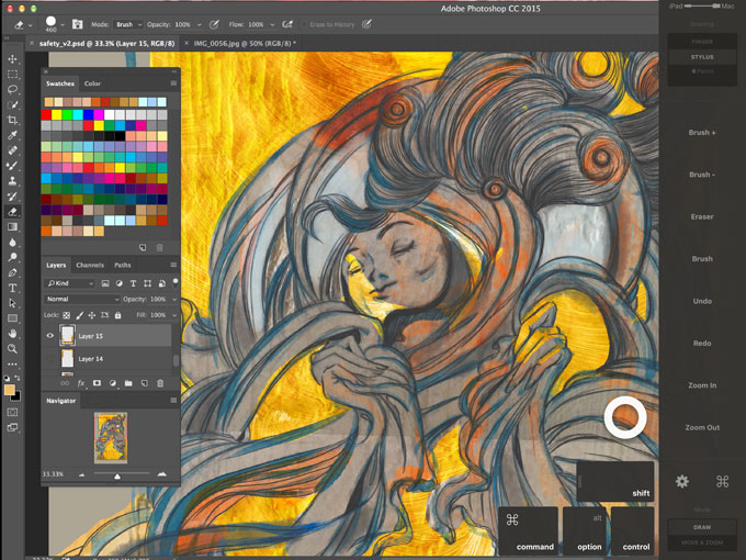
I tend to like working with both digital and traditional mediums, and have incorporated the iPad Pro into my process. Using Photoshop, Astropad (to connect my Macbook Pro with iPad Pro), and drawing with Apple Pencil, I took an initial woodcarving and created a mixed media illustration.
Going through the stages of this project, I hope to inspire you to learn some ways in which the iPad can be used as more than a novelty.
m_woodcarving

1. Find Ideas and Exploration

A sketchbook and camera in one, the iPad is a perfect tool to capture moments of inspiration. While carving a woodblock, I really started to like the grain and gouging textures. Using iPad’s built-in camera, I took a series of snapshots that I later collaged in Photoshop.
This is a great method to take images for textures, reference materials, or mood boards. And of course, sketching out, or writing down notes is always possible.
Astropad Tutorial

2. Versatile workflow

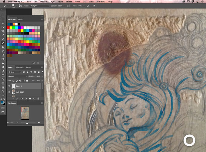
Along with ideation, there are many ways to use an iPad to bring a composition together. After the first layout, I drew an overlay sketch. From this point forward, all line work was made using Apple Pencil on iPad Pro.
What’s nice about this setup is the precision it allows. For me at least, this has been the closest experience to drawing on paper. Apple Pencil has the look and feel of an art pencil, but the iPad’s glass surface can take some time to adjust to.
But how am I able to access Photoshop from my iPad? Running Astropad on both my Mac and iPad, allows the iPad to double as a graphics tablet. This gives you the ability to yourself myself all around your studio, and still be connected to the file you're working on.
IMG_0090

3. Mix it up and combine together

Does this mean that you should drop everything else for iPad? Not at all. I still take the time to paint and use a scanner to get a certain texture every now and then. You shouldn’t have to compromise your comfort when adding to your creative arsenal.
The iPad’s mobility makes it easy to share ideas and collaborate with others, in person or remotely. Many professionals are already using iPads to showcase portfolios, client work, and mock-ups. Now add conception, production, and finalization to the list of capabilities, and you have a more resourceful device at your fingertips.
An iPad alone doesn’t fill the whole design process, but add a good stylus and professional programs, and your workspace expands wherever you go.

Malyse Mckinnon works at Astro HQ. She is an illustrator and graphic designer based in Minneapolis, Minnesota.

Sunday, March 20, 2016

The 9 Graphic Design Trends You Need to Be Aware of In 2016


The 9 Graphic Design Trends You Need to Be Aware of In 2016


by Janie Kliever
More than the patterns that emerge from the Popular feeds on Dribbble and Behance, design trends can be a mysterious thing.
They’re influenced by culture and media, past and present, technology, fashion, and other industries.
They come and go, but it’s hard to say exactly when.
Madeleine Morley at The American Institute for Graphic Arts (AIGA) says:
“A trend never simply emerges for a single year and then disappears in a puff of smoke. Instead, an aesthetic becomes popular gradually, even mysteriously, over time before fizzling out slowly without much notice at all.”
The design trends we’ll be covering here didn’t magically materialize in late 2015; trends take time to peak, and you’ve likely seen many of them in one form or another during the last couple years.
But even if you’re not one to follow the trends, as a designer, it’s smart to be aware of the shifts going on in your industry—if only to avoid them before they become overused, or to have the opportunity to twist them into something new and interesting.
While forecasting trends with any certainty is a tricky business, many members of the design industry seem to have developed a consensus as to what styles and approaches are most likely to take off in 2016.
We’ve rounded up nine possible trends to keep an eye out for:

01. “Modern” Retro Style

As opposed to vintage or “old” retro—styles that draw from the early 1900s through the 60s—“modern” retro takes its stylistic influences from more recent decades, the late 1970s through the 90s. Think early PCs and video games, pixel art, and space themes: nerdy is the new cool.
Let’s look at some examples:
This illustration and t-shirt design by Ralph Cifra has all kinds of nostalgia going on. The technology theme also ties in nicely with modern-retro influences.
1
And The Welcome Branding Group’s ad designs for a music store have a retro yet contemporary feel, complete with vinyl records and a solar system:
2
Some distinctly 80s style from stationery brand Write Sketch & andOfficemilano:
3
Screen Shot 2016-01-15 at 2.25.14 PM
And lastly, some limited “pixel edition” packaging designed for Coca-Cola byErin L. M. McGuire. It features space invaders from the arcade video game of the same name released in 1978.
Screen Shot 2016-01-15 at 2.30.14 PM

02. Material Design

6
Google made quite a splash in the design world when it introduced its material design guidelines. This visual language is characterized by “deliberate color choices, edge-to-edge imagery, large-scale typography, and intentional white space” for a bold, graphic look, according to Google.
Some are referring to material design as “Flat 2.0” because, in many ways, it’s an update to the flat design trend, adding light/shadow, depth, and movement for a more tactile sense of realism.
Though Google created it for web and mobile, you’ll see material design principles popping up in all kinds of design formats.
This website concept from Balraj Chana incorporates many material design principles, including bold colors, large type, and light and shadow effects. Card- or tile-based layouts (see the menu elements to the left of this image) are also part of material design. For more on that, see trend #6.
Screen Shot 2016-01-15 at 2.33.59 PM
Some Flat 2.0 illustrations for a weather app from Disky Chairiandy that integrate light and shadow effects for a sense of depth:
8
Here’s another website, designed by Al Rayhan, that features bright, contrasting colors and some card-based navigation, but with a more traditional design—a good compromise between conservative and trendy.
9
If you’re looking to try out one material design’s vivid color schemes, check out Material Palette. It’s a color scheme generator that can help you quickly and easily choose a versatile selection of hues.

03. Bright, Bold Colors

Fitting in with both 80s/90s styles and material design, vibrant hues should continue to prove popular picks into 2016.
This trend would be a move away from the more muted, 1960s-inspired palettes to favor bright pastels, neons, and richer, more saturated colors.Pantone’s Spring 2016 Color Report falls right in line with this prediction.
Screen Shot 2016-01-15 at 2.39.28 PM
A nearly neon shade of green paired with golden yellow really makes this poster pop. It was designed by In the Pool, a Paris-based studio.
11
Here, Michael Fangman applied some bright pastel gradients over the imagery in his landing page design:
connection-fullres
Finally, a clearly 80s-inspired design from Tron Burgundy with electric colors and geometric shapes, which brings us to our next trend:
Screen Shot 2016-01-15 at 3.30.10 PM

04. Geometric Shapes

Geometric shapes and patterns are a motif that aligns with some of the 80s-era trends we’ve already looked at. This one can be applied in all sorts of ways—as individual graphic elements, as backgrounds, as an illustrative technique.
Also keep an eye out for a style known as “low poly,” which got its start as a 3D modeling technique for video games. This angular, faceted look will continue to show up outside the gaming world, in web and print projects (such as the design below by Vivek Venkatraman).
14
There are plenty of tutorials out there for creating a low-poly effect, either from scratch or taking a shortcut with a tool like this one. Or just pick up a selection of free low-poly textures to try out the trend the easy way.
Here’s another take on geometrics from Tank Design, with layered shapes forming a colorful backdrop for a business card.
Screen Shot 2016-01-15 at 2.48.28 PM
Kyle Anthony Miller uses hexagons to liven up an email template and even crop photos into matching shapes:
16
Colored triangles on this chocolate packaging by Bag of Bees create an eye-catching background and symbolize the products’ flavors:
Screen Shot 2016-01-15 at 2.50.19 PM
Lastly, in the following branding package by Simeon, simple circular and rectangular shapes combine to form a versatile visual theme:
18

05. Negative Space

Negative and/or white space is an essential part of any good design. But used strategically, negative space can be a clever way to add deeper or double meaning to your designs, particularly for logo and branding projects. Or it can simply help give your composition a more minimal look.
In this design for a restaurant called “The Swan & Mallard,” John Randall has creatively managed to fit a swan, a mallard duck, and an ampersand all into one logo though the interaction of positive and negative space.
19
In a different way, the negative space in this logo by Sameer Ahmed lends movement and context to the word being spelled out:
20
Look closely at the shapes and spaces created by the violin in Sam Hadley’s concert poster. They form a series of numbers—1, 2, and 3—which are part of the event name.
Screen Shot 2016-01-15 at 2.56.48 PM
And a couple more abstract, but equally effective, designs. Both work to support a theme in an unexpected way.
The first, by Andrea Minini for PETA (People for the Ethical Treatment of Animals), takes a minute to appreciate fully. At first glance, you see some abstract, ribbon-like shapes, but then you notice that the negative space formed by those shapes look like animals.
Now you can see that the ribbons themselves also look like animals, and the interaction of the positive and negative space creates a series of figures that blend seamlessly into each other (from left to right, a bird, cat, rabbit, gorilla, dog/wolf, and bear) to form a sort of optical illusion. Can you see them all?
22
The next, a book cover design by Jason Booher, takes a concept from the title (immersion) and uses only curving lines and the negative space they create to suggest (in an abstract way) the image of a person immersed in water or some other substance.
Screen Shot 2016-01-15 at 2.59.24 PM

06. Modular Layouts

Modular or card-based layouts have been adopted by some of the biggest brands for their websites and mobile apps. But organizing designs (of all mediums) according to a grid is nothing new.
It’s the self-contained modules or cards used as the primary organizational principle that has created the twist of a new trend.
This website layout from Balraj Chana fully embraces that trend, including card-style graphics and navigation in multiple configurations:
24
But layouts don’t have to follow a strict grid where everything is perfectly aligned. They can be a little looser or more freeform and still serve as an effective organizational tool. For example, this design from Natalie Armendariz:
25
Or this one (sporting material design colors) by Julien Renvoye:
26

07. Dramatic Typography

According to this trend, typography isn’t just for reading—it’s for making a statement. Look out for big, bold type that’s the center of attention. You can create drama through size, but also through color, texture, or arrangement.
SNASK’s design may use all those qualities and more for its loud and lively typography. The agency handcrafted a series of letters to create the cover art for a magazine.
Screen Shot 2016-01-15 at 3.09.30 PM
Screen Shot 2016-01-15 at 3.09.52 PM
Though more subdued in style, this entirely type-based design by Brendan Prince juxtaposes different typeface styles and sizes for an engaging, eye-catching composition:
29
In contrast, this much more minimalistic approach from Ben Schade depends largely on color and shape for its drama:
Screen Shot 2016-01-15 at 3.12.05 PM
As our last example in this section, Julie Joanny’s typographic poster features a freeform arrangement of some of the letters plus textures and linear elements to enhance the type:
31

08. Custom Illustrations

It’s been said that stock is dead. But even if it hasn’t quite breathed its last breath yet, stock photography and graphics are more frequently being replaced by custom imagery or illustrations.
After all, no designer wants their work to look generic, and no business wants elements of their branding to show up on a competitor’s website. So many designers have been putting in the extra work to create one-of-a-kind solutions.
As brands continue to embrace design thinking and other design-centric approaches, this tactic of making imagery more personalized and relatable should continue to grow.
For example, Vlad Shagov at Railsware has updated his company’s website for the new year with a cheerful, custom-illustrated header:
32
Dropbox also takes a personalized approach to its homepage imagery with friendly, casual illustrations—more like doodles—that support the information being communicated:
33
Saudade Tea’s packaging takes this tactic in a more traditional direction, with beautiful watercolor illustrations:
Screen Shot 2016-01-15 at 3.16.48 PM
Screen Shot 2016-01-15 at 3.16.58 PM

09. Abstract, Minimalistic Style

In contrast to the more flamboyant, 1980s-inspired design styles we’ve seen so far, this trend relies on minimalism and deconstructing or distorting recognizable forms.
For instance, Aurėja Jucevičiūtė’s identity for a music school picks apart some of the shapes associated with musical notation and puts them back together in a unique way:
36
And here’s an album cover designed by Lukas Haider that does feature vibrant colors, but text is kept to a minimum and the primary visual is a blend of abstract, vaguely organic shapes:
Screen Shot 2016-01-15 at 3.20.00 PM
Lastly, these two designs from StudioBrave and Kajsa Klaesén integrate geometric shapes and bright colors like some of the other designs we’ve looked at, but do so in a simplistic way, with plenty of white space and a seemingly random layout.
Screen Shot 2016-01-15 at 3.21.57 PM
39
To get started on your own minimalist design project, make sure to browse through our selection of 60 Free Fonts for Minimalist Designs.

A Closing Note

Following trends just for the sake of being trendy usually isn’t a good idea. If you do decide to try a trend, make sure it’s a good fit for your project and audience. Or just save most of your experimentation for personal projects.
Do you plan on jumping on board with any of these trends, or perhaps combining them like many of the designs featured here? Or do have any predictions of your own? Let us know in the comments!

articel source by Design scholl Canva